Augmented Perfection; covering the skin

After looking at Karla Black's beautiful sculptural, tactile work, I was inspired to develop ideas and thoughts and think of some inspirational and unusually interesting photographs to transform my ideas from words into visuals.

I wanted to then develop my visual imagery into a resource that I (or other design teams) could use for initial influential trend indication. This will take the form of a trend book that will be usefully available to understand the tone and mood of the body of work.

I reflected on my list of words and verbs, which was something that I found useful as it meant that I could generate visual imagery that was not immediately (and obviously) associated with the theme of surgical modification and enhancement. I decided to start to consider ways that the skin could be covered, altered and modified with something that is obviously artificial and synthetic. I opted for using the hand as the subject and used a series of hyper-intense paints to cover the skin, using fluid and free moving liquid.

The natural movement of the fluid is juxtaposed with the super-bright artificiality of the paint. The turquoise blues, lime greens and cool greys contrast well against the more soft flesh tones of the skin.

 Working with these beautifully intense colours is something that I will carry throughout the project, which is taking a step outside of my comfort zone of neutrals, greys and accent tones.


Karla Black: Materials

After exploring the theme of idealism/perfection through a series of spider diagrams and bullet points, I felt that it would be useful to look at some artist reference points. When exploring perfectionism in terms of our appearance, I thought that it would be interesting to look at cosmetic products and how I could use these as a way of drawing/painting. I intend to use make-up products alongside other materials that could be associated with beautification in an unconventional method.

2011 Turner Prize nominee, Karla Black, also explores using these materials to create other-worldly sculptural forms, primarily focusing on materials. In YouTube interview "Karla Black: Structure and Materials" she explains that she is "not using toiletries for their connotations". I, however hope to explore the connotations of these materials in order to translate my theme from language to visual imagery (which can be a challenge at this early stage in a project).


Black's piece "At Fault" (above) showcases an entire range of materials including bath bombs, plaster and paint powder, petroleum jelly and make-up. The blend and combination of materials is deliciously tactile and almost dares you to touch it. The range of ice cream colours are not intended to be feminine, however the association with the colours exude a girly childishness. 


The soft nature of the colours are beautiful and I feel that some of the pastel shades may apply to my work but my colour palette will be established once my own visuals start to take shape. Additionally, I want to be bold and brave with my colour choices and perhaps clash a series of unexpected colours.

I also love the dynamic 'movement' to the sculptural forms. The torn edges of paper, the scattering of powders and liquids and crushing of bath bombs give life to the work. I would also like to retain a sense of life to my work and could use the actions of what make-up is intended for when creating my paintings and drawings eg; to cover, to enhance, to colour, to decorate, to layer


Final Major Project; ideas

Deciding on a theme for my Final Major project has been horrid. It seems like a very important thing and I have felt that it is imperative to get it right. I wanted to approach my project in the same way that I had loved when creating my trend book with Beth in last year's Unit X. 

We identified a problem or issue that could affect the design world, listed the issues surrounding it and then began to translate it into visuals that formed the basis of our trend book. I intend to then push the visual imagery that I generate further and use these as a springboard towards creating final outcomes towards the end of the project.

After much frustrating deliberation, I had identified that as a society, we are very much fixated on our appearance and aesthetic. We are obsessed with body image. Make up, diet and even surgery are all avenues that are explored in an attempt to be what is now deemed to be "perfect".

After brainstorming a huge collection of ideas, I wanted to make it clear to myself that it was possible to make these ideas visual before carrying it any further, so I decided to make a 'verb list' that I could then use to explore with materials.

I firstly considered what make-up is used for;

To conceal
To resurface/smooth/cover
To enhance
To colour
To alter
To decorate
To layer
To add shine/mattify

I was satisfied that this would give me lots of avenues to explore and with a selection of materials this would mean that the outcomes could be varied dramatically.

I also looked at cosmetic surgery;

To reconstruct
To enhance
To cut
To remove
To make bigger/smaller
To tighten
To pull
To fill/inject/smooth

I then considered the materials that could be associated with cosmetics and cosmetic surgery. I immediately thought of using the products themselves (make up etc) and silicone, plastics and synthetic materials.

Manchester School of Art: Degree show, 2014

Towards the end of the year, the usual buzz of the studio space had begun to patter out and eventually, the space that was usually a hive of creative activity and colour became a sterile, white area. Upon my return to university to visit the degree show, the usual explosion of presence and colour had returned and the final year work was displayed throughout the space.

As I will be entering my final year of the course at the end of the summer break, I wanted to look at as much of the work of fellow students from my course as possible. I wanted to see the standard of which I must strive to be at and I wanted to know what was expected of me in order to stand out from fellow students in our degree show next year. 

Looking around the show also provided me with an opportunity to look at the ways that students had decided to present their work. Some had used conventional techniques that allowed the work to speak for itself. Others opted for more complex methods, suspending, hanging and draping their work and fabric and a select few had used objects such as light-boxes and wooden display boxes for the work to sit on top of.

Jessica Beardmore's degree show work was one that stood out for me. Her clean, minimalistic style looked crisp and professional and it was clear that she had an eye for presentation and layout. In addition to the work looking professional, there was a substantial body of work that was relevant to her audience. She had created a webpage (that was presented on an iPad) and a lookbook to sit alongside her printed clutch bags and accessories.
Beardmore's development of a brand identity was another aspect of her work that stood out. Her label, Intangible Notion works incredibly well and is suitable for her intended audience. Knowing which context your work sits within is paramount and she has identified where she sits in the fashion market.


Her simple, yet considerate approach to presentation means that the Intangible Notion lookbook is a beautiful document that links perfectly with not only the products, but the brand as a whole. As part of my own practice next year, I'd also like to develop a strong visual aesthetic that my entire project will follow, from my initial research, sketchbooks and photography, right through to the presentation of my samples and garments.

As a knit specialist, I wanted to look at the work of the knitters in the year above for inspiration. All students had created a range of knit samples but some had further developed these samples further and created garments. I feel that this is the path that I will want to take next year so I was interested to see the types of garments that some of the students had created.

I was particularly drawn to Rosie Brett's collection of samples and final garment. There appeared to be a strong visual link that ensured her samples looked like a collection, drawing on tribal-esque fringing techniques in a select colour palette of greys that are accented with blues and flashes of yellow.

I also like the ways in which Brett has used matte yarns such as lycra/elastic with fluffier, more natural looking fibers in the fringing. I also think that the use of a charcoal/grey and black colour palette with accents of rich blue and yellow keeps the collection looking refined and fresh.

Rosie Brett's final garment draws on several techniques that can be found in some of her samples. The heavily fringed sleeves and torso section of the jumper gives the garment movement and the individual strands of yarn create a piece that feels alive.

The intricacy of the fringing must have been rather painstaking and taken many hours of care and effort. the finish is professional and well executed. Finish is something that is very important in order for the work to look professional. I did notice that some of the knit samples from other students had not used the correct tension on their first row, resulting in a slack and sloppy edge.


The dip-dyed effect of the bottom portion of the garment is also done well and compliments the blue individual strands found in the fringed sleeves.

One of the only disappointments I have with Brett's final collection is that I wish there had been more garments. I think the garment that she had made was finished beautifully and works really well but I would have loved to have seen more from her.

Whilst looking at the Degree show work, I also wanted to identify some designers that work in a different way to myself. I wanted to use this opportunity to broaden my horizons and look at a range of work that challenges the way that I work. 

I am usually quite reserved with my use of colour and I feel like I should use my forthcoming final major project to challenge myself and be much braver with my colour palette. With this in mind, I was intrigued by Josie Satchell's playfully tactile printed fabrics.


Satchell not only applies colour bravely and freely to her designs, but she also uses a range of skills and techniques to enhance the tactility of the fashion fabrics. She combines both screen and digital print techniques with embroidery and laser cutting aspects that add depth and dimension to the fabrics. She also touches upon using foils and small beads that are integrated into the designs.

This is something that I have touched upon in previous projects but I feel that it is something that I want to explore further in my final major projects. I'd like to use my developed knitting skills along with foiling, embroidery and laser cutting techniques to my work, in the hope of creating fabrics (and hopefully garments) that are exciting to look at and to touch.

Additionally, Satchell has created a professional website to showcase her work that has been beautifully documented and photographed. This is similar to how Jessica Beardmore has presented her work and seems to be a natural progression when moving into the working world of employment/freelance design work.


Looking at the work of final year students has made me feel a strange blend of fear and excitement. I know that the year ahead will be challenging and difficult but I'm so excited to develop my own skills and build a collection of work that will see me progress into employment.


Evaluation of Unit X.

At the beginning of the unit, we formed larger groups to learn how to identify forthcoming trends. During this initial period, talks from Trend Boutique's Sally Denton, presentations from university staff Alex and Laura and our own research helped us to become hyper-aware of the world around us, identifying key issues that could affect design in the future.


Exploring social, economic and political factors showed us that it is important to look at other issues, giving a project more body and meaning and ensuring that you are resolving a larger problem through design. However, developing this understanding was difficult, it was like training your mind to think in a completely different way.

Our presentation looked at several issues, however when the groups were condensed down, me and Beth felt that the most important and interesting issue that we wanted to explore was the shift of people shoppping online as opposed to in store. We decided that higher-end designers might want to combat this and reverse the effect that technology appears to be having on the store.

We thought that it would be both interesting and challenging and it has proven to be both. Initially, the mock-ups below were a way of visualising our concept. The idea of developing fabrics that could not be photographed became a key idea that our entire trend revolved around.

After establishing the ideas that we wanted to explore further, it was important to us that we kept our selected audience in mind. We both wanted to aim for a high-end client. I felt like this audience could be reached through presentation: Using presentation that is considered, high quality and a finish that reflects this (eg size and format of the book).


Beginning to transform our ideas from an abstract concept to a tangible, visual reality was extremely difficult. We developed many, many ideas to try and personify our concept but it became quite frustrating having nothing but words and we needed to try and shift into visual territory.
We began to explore the concept of over-packaging products, concealing them in an attractive but temporary covering. Other designers already used this method (see Zara, left)to build a sense of anticipation to pull away the layers to reveal the product inside.

Our ideas had to be visually collated and then arranged beautifully and developed into a trend book. This was a particularly daunting prospect, considering we were yet to produce any visual work of our own.
 
 
Myself and Beth decided to take the concept of over packaging to an extreme and developed a series of photographs to visually represent our ideas. The box series of photographs appeared to work beautifully, presenting a selection of materials including frosted plastics against a stark white background, creating a sleek and clean aesthetic.
Working in a pair seems to work really well for both me and Beth. We feed from each other's ideas, encourage one and other when we seem to hit a wall. Also, we share an eye for presentation and attention to detail. This ensured that we could both present ideas and imagery creatively and beautifully and keeping to a style that we both enjoy working in.

Our partnership helped to create lots of interesting ideas that grew and evolved into a range of visuals, representing ideas such as overpackaging, encasing (in ice) and changing state, meaning that something could never be captured in its true form.
 
Both of us also found the importance of planning and arranging our images paramount, in order to present them well enough to speak for themselves. Organisation ensured that we knew exactly how we wanted to lay our images out.


Varying our layout and using some photographs as whole page spreads will hopefully look visually exciting and will help to showcase some of the best images. I'm still very intrigued as to what the book will look like as a finished product as Reprographics (where the book is being produced) are apparently leaving producing our book to the very last minute.

 Progressing through the book has been particularly difficult. Due to time limits, we had to produce a large amount of pages for our book in a week, with only our own judgement to go by. However, this was one of the benefits of having a partner to work with. It meant that we could alter and change any aspects we were unsure of and pull each other back from insanity when we found the work tough.

I feel like the finished layout of the book appeals to our intended, high end designer clientele and this can be seen in the ways in which we have chosed to package our book.
We have decided that we would like to continue our concept through our presentation of our book. We have created several boxes that fit inside one and other (in a similar way to our photographs), exploring our over-packaged and encased concept further.

Overall, I feel that I have worked really well as a team with Beth. We have created and developed a large body of work with finesse in quite a short amount of time. We have powered through obstacles such as time limitations to allow for printing and production, juggled a live brief alongside the main body of our work and have managed to excecute both well. 
 

Pitching ideas to curate lookbook for Rianna Phillips

Throughout the unit, as well as developing our own body of personal work, we have undertaken a live brief, in the hope to win the opportunity to curate accessories designer Rianna Phillips' lookbook for her forthcoming collection.

It has been quite difficult to balance the time between the two projects, however throughout the year, we have had a number of tasks to juggle at any one time and it does appear to be getting slightly easier over time.

The pitch came round quickly and meant that we developed a large body of work in quite a short space of time. Beth and I felt that it would be best to organise our work into boards and present this in a slideshow. These could then be printed and handed in for our assessment and marked accordingly.

Our boards have covered everything from our initial influences and inspirations, through to a consumer profile, competitor research, boards of our test shoot images and mock ups of our images being used for an ecommerce campaign and other specially designed square images(to avoid cropping) to be used on Instagram, an important marketing tool used by Rianna.

I feel like producing such work could give us the edge against our fellow students. It considers important factors and visually represents how our work could potentially look, if we are chosen to go any further. Overall, the pitch appeared to go well. Me and Beth spoke confidently about our ideas and answered any questions that the client had.

The importance of social media (particularly Instagram) in self promotion for designers and makers is on the increase. Rianna Phillips has acquired both customers and stockists through Instagram, providing free business promotion that has a wide reach to many.


This was especially exciting for me and Beth when Rianna included snipets of our work on her Instagram account. It made us feel positively about the ideas that we had produced and meant that the client felt confidently enough about our ideas to post them to her customers, stockists and fellow designers.

It is now a waiting game, to see who Rianna will decide she would like to work with in creating her lookbook. I have thoroughly enjoyed working with Beth on an exciting brief that could potentially lead to some valuable experience.

Detail and execution.

After the tutorial today, we were given a chance to scrutinise the details, layout and other factors of our book with the help of tutors with fresh eyes. They were yet to see our progress so this was of great help.

We looked at important aspects such as font point size and took on board some suggestions of increasing the size of our key, pivotal words, decreasing our page number font size and making some small adjustments to some pages in terms of layout. Mainly, our layouts worked really well and were received positively which can only be a good thing as our time on this project is reaching its close.

Our deadline for completion of the book has been drawn in and cut short to allow time for printing which means the pressure is beginning to mount. In this time we must also consider making and designing a cover for our book and research into creative methods of storing our trend book, drawing on our concepts and ideas.

Live brief work for Rianna Phillips

While progressing with our trend book, Beth and I have been juggling our work with creating a body of work for Rianna Phillips. Other members of the FutureIntelligence project are also taking part in this, in the hope of winning the chance to curate Rianna's latest lookbook for her new collection. This has naturally progressed into some sort of secretive competition between the groups.

The competitive nature of the project has ensured that everyone's work has remained top secret. Similarly, it is paramount that Rianna's prints and product designs remain secret, so our visual work and ideas will be presented in a port folio and will not feature on the blog.

It seems that our work has progressed well and our ideas have been warmly received. We have spent time and effort on this project and feel that we are working to the best of our potential alongside our other work.

This coming friday we will be presenting our work in a formal pitch to Rianna and the other members of the project. This will be a good opportunity to prepare a professional presentation and get used to 'selling' our ideas to a client.

Arranging, sorting: fitting the jigsaw together.

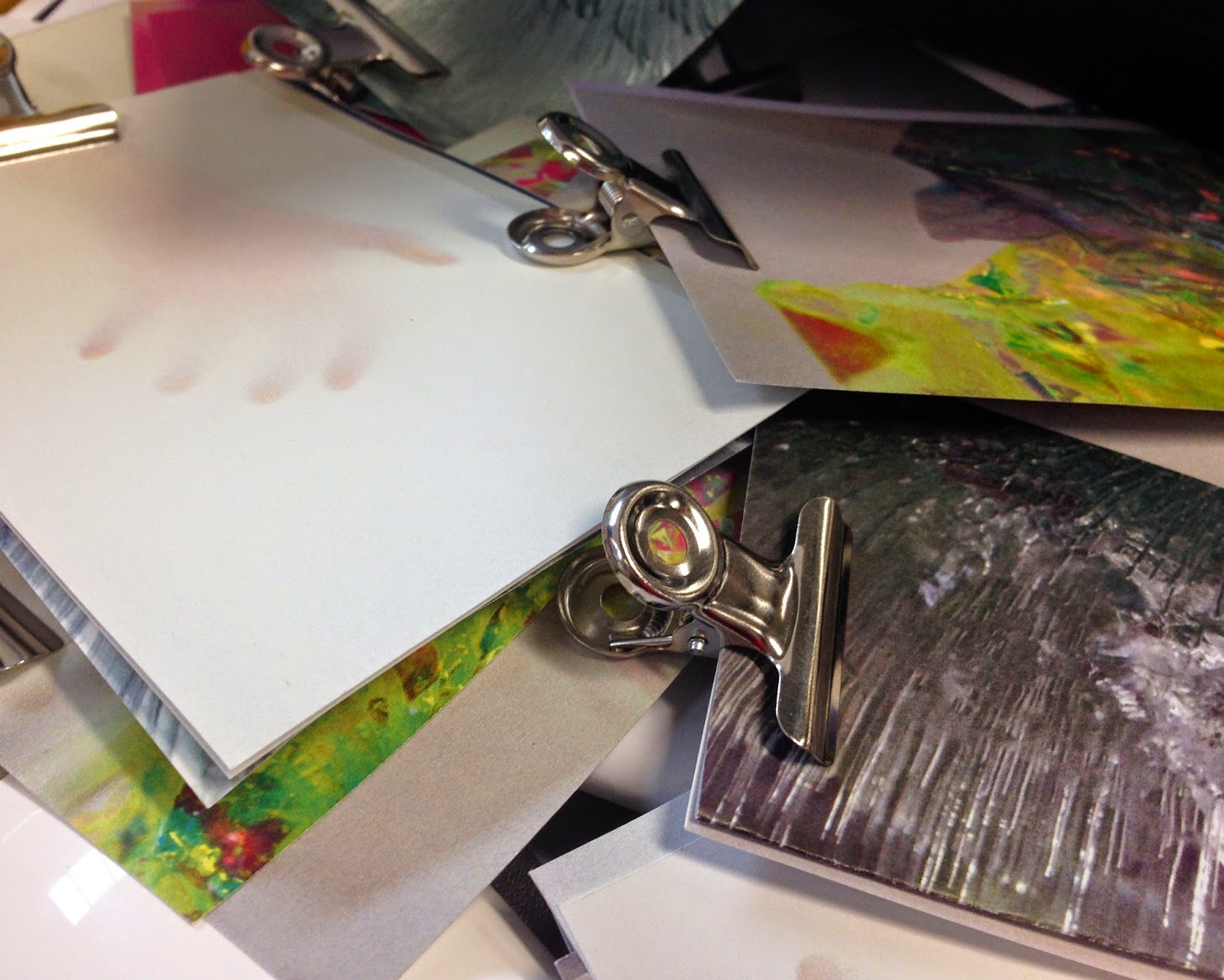
After editing our photos to enhance sharpness, colour and general appearance, arranging the photos and sorting methodically seemed like the best cause of action for solving the presentation issues that we were presented with. Using the table space around  helped us to develop a vague sense of how the photos may be laid out over the double page spreads of a book.

This was a very time consuming process, however I believe that it was the best way to deal with organising the photographs.  After being spread out, chopped and changed, the photos were the grouped together (rather prettily with shiny bulldog clips) in order to maintain some sort of order to the chaos that was likely with so many different photographs.


You can already see certain links and relationships between the images appearing when they are all placed next to one and other. Colours from other photographs begin to sing when put with others, suggestions of how the photographs might possibly link fashion or the body are provided by the images of hands and icy photographs link across the box images and the form also works beautifully with the crumpled iridescent film.


The next stage will be to start placing the book pages together electronically. After only a few lessons on InDesign, I don't feel ready to start using this to put the book together. It would be more in the interest of time to put the pages together on Photoshop, as my skills are proficient enough to arrange the photographs quickly.

I'm quite excited to see what the book will turn out like, however time is against us. Myself and Beth intend to put the book together as soon as possible, in order to leave enough time for printing. This is providing that our layouts are correct as we will not have any staff contact until our next tutorial time. It seems like the time to start trusting our own judgement and draw upon skills that we know we have. We both have a keen eye for layout and I feel that this will definitely be to our advantage.

"Something else"

After the tutorial, we wanted to gather a range of materials that relate to the selection of photographs that we already have. We decided on bondable film (see previous unit blog posts) as the iridescent properties reflected our theme, altered in state when creased and colours refract, change and differ according to the light.


We decided to combine this with other materials such as frosted polypropylene, the boxes that we had already created and the body. This completely alters the way in which that we interact with the photographs and ensures that you can create connections and links that would not have been obvious at a first glance.


Although seemingly unrelated, when placed with other photographs and in the right composition, the images will hopefully tell a story. The coupling and teaming of images will be essential and must be something that we spend time and effort with.

We have already chosen to have our book 37cm X 27cm, which is slightly smaller than the standard A3 size. I feel like this will lend itself well to the idea that our book is aimed at a higher end audience, rather than a cheaper, lower end.

Tutorial with Alex; change of direction

Beth and myself attended a tutorial with Alex and brought a range of photographs from both the boxes photo-shoot and the more recent ice formation photo-shoot. 

I was pleased with the selection of photos that we decided to take with us and wanted to figure out some sort of configuration or format that would show the imagery off to it's best potential.
Alex told us that the photos were nice, but were perhaps a little too finished. After a more in-depth discussion, we came to realise that we needed to take more photographs to sit alongside the pre-exisiting images. I need to constantly remind myself that this needs to be a source of inspiration for design. Alex suggested pairing the photos with a suggestion of the body, materials or other unrelated but suggestive images that provide the audience with a catalyst to spark their own ideas.

A suggestion of "something else" will help to trigger an explosion of ideas and will allow the audience to look at colour, form, composition and any other pieces of information and use this as a potential starting point for their own projects. This appears to be the next stage in pushing our trend book further.

It was also suggested that we visit reprographics in order to enquire about how we might want to put our book together.

Jule Waibel


As well as looking at encasing and trapping products in different substances, using unusual methods, we wanted to look at products that change in appearance when exposed to the flash of the camera. After looking at the colour changing creations of Alexander Wang and Lauren Bowker, I came across the work of Jule Waibel. 
 
Waibel has created a collection of garments from a newly developed paper-like fabric that is both tearproof and water resistent.
 
The origami style construction of the garments means that with every movement, the garment shape changes and alters, meaning that each photograph will never be a true representation of how the garment may actually look. This links remarkably well with our own ideas of a fabric that could be affected by another factor, making it nearly impossible to capture the product as it looks, at that exact moment.
 
I also think that the colour and quality of the fabric is beautiful. The semi-transparent layering and folding creates amazing depth and tones of soft, fleshy pink.


Trapping fabric in dye and freezing


After considering a number of different methods of encasing fabrics or products, we decided to attempt freezing.

Encasing and in a way, protecting, is one of our main concepts. We feel that finding experimental methods of doing so will help to relate to the theme and ideas of our trend. We want to protect and encase products from prying eyes and therefore blocking the lens of the camera, preventing photography and therefore documentation on online stores.

The turquoise blue colour has concentrated beautifully in a few patches, creating a focal point and giving the images depth.

When partially frozen, I removed the mass and shook it vigorously. I believe that this resulted in the multitude of flecks and air bubbles that can be seen in the photographs. This was a sort of 'happy accident' but I think it improves the images vastly. The bubbles, cracks and imperfections with the ice work beautifully with the dye, which appears to have clung together and developed into a concentrated area of colour.

Again, I think it might be difficult to determine which photographs are the strongest and it will take time to decide on a configuration/ layout. 

The transparent, glass-like quality allows for just the right amount of information to be presented to the audience. This crystal clear appearance is clouded by the concentration of colour, cracks in the ice and the built up areas of air bubbles.
I feel that this is an extremely creative and unusual way to protect the fabrics or products from the prying eyes of photographers and lends itself well to the high end market that it is intended to inspire. I think that it will also be a good idea to take smaller sections of some of the weaker photographs and use them with the larger photographs.

I feel that the turquoise/seafoam green colour could be something that is carried through as an accent against the white-on-white aesthetic that I expect will be consistent throughout the book.

A box within a box within a box within a box...

To start visualising our ideas, we decided to make our own boxes. We created boxes in a variety of differing sizes that fit within one and other. For a clean aesthetic, we wanted to use semi-transparent materials or white card, but we opted for sheets of frosted polypropelene that work very well. Even though the material looks clean and effective, it was extremely difficult to photograph against the white backdrop that we wanted to use and my camera found it very difficult to focus, making the entire task take much longer than expected.

The masses of boxes represent the idea of over-packaging a product or containing something in several layers of protective matter. The smallest, iridescent box is placed carefully to symbolise the product, the pearl of the oyster, so to speak.


I feel that the white on white look of these photographs works beautifully. I also think that the iridescent quality of the smallest cube(the prescious and protected product)provides the images with a focal point. This effectively conveys our message of using packaging as a method of protection, being protected by layers of packaging.


As I feel that many of the photographs that were produced from this shoot were successful, I feel that it is going to be rather difficult to select and edit a small number that work best. I feel that test layouts using paper to imitate the pages of our trend book will help us to determine layout with more ease.


Packaging/Over-Packaging (by Zara)

After showing our ideas to Laura and Alex during a tutorial, we wanted to look for tangible examples of our ideas and ways to make the abstract visual. We considered packaging as a way of protecting and preventing the subject from being documented and photographed. We also thought about boxes within boxes, similar to the russian doll effect, a version of pass-the-parcel: Over-packaging.

After researching this further, we discovered that high-street store Zara use a similar method but to a lesser extent. The frosted plastic which protects the initial box adds a sense of higher end quality. Then, inside the first box is another box which contains your ordered product alongside other packaging such as tissue paper.

This method of storing and delivering a product really personifies our ideas of protecting and concealing fabrics/products. We need to consider ways of containing objects and over-packaging them for our own trend and hopefully this will reflect our other ideas inadvertently.
We intend to perhaps use different shapes and different materials in order to represent our ideas and to tie the entire aesthetic of our trend book together.

Alexander Wang A/W 14 & Lauren Bowker

I was already in love with Alexander Wang's beautiful A/W 14 collection, seduced by the strong, andgrogynous shapes and intricate knitwear. I only recently discovered that the garments started off as dark green or black and due to the use of thermo reactive dye, then changed colour to lime green, turquo-blue and purple.

This change in state could be something that links really well to our initial ideas and explored ourselves. Is there an ink or dye that is sensitive to change in lighting conditions? If so, this could mean that fabrics could change when the flash from a camera glares it.


I feel as though the idea of changing colour, shape or form could definitely developed as part of our trend and this collection is a prime example of it working beautifully.
  
Similarly, but perhaps in a more dramatic way, MMU graduate Lauren Bowker has worked extensively with thermochromic technology, dyes and inks.


Her leather garments were coated in a layer of the ink and exposed to heat produced from a wave of fire during a performance art style presentation. I am keen to work with fabrics that could change state and the two examples above show the different ways in which this can be done.

Phillipa Wagner's blog shows these two examples and is a source that I often use when looking for contextual references:
http://www.philippawagner.co.uk/blog/15/

Unphotographable

Overall, I feel much happier working in a pair with Beth. I know that we can communicate effectively with each other and I also know that she can be relied upon to work hard alongside myself.

Now that we had decided upon an idea, we felt that the best place to start would be to brainstorm all of the way that garments may be "unphotographable". Ideas include:

Reflection/glaring light
Change in state, colour, shape, form
Sensitivity to light
Contained/ Concealed/ Trapped
Time-limited fabrics
After brainstorming many, many ideas, we felt that it might be useful to start gathering ideas visually and decided to put together some boards of exisiting work to represent our idea clearly.


The first board represents the idea of encasing fabrics within something to protect them from being photographed. Experimentation with ice, gelatine and plastic will help us to determine the next step and help to establish what will work for us.


The second board (above) shows the idea of a garment/fabric being time limited in terms of its existence. We looked at the work of Maison Martin Margiela, 9/4/1615, a collection of garments that are exposed to mould and bacteria, gradually leading to their deterioration.

Similarly, Helen Storey's Say Goodbye features a dress gradually being lowered into highly corrosive acid, leading to the garment disappearing entirely.

We also thought the idea of "turning into a pumpkin" at midnight, a la Cinderella was an interesting thought and could  be something that could be explored further.
We appear to have lots of ideas and now it is simply a case of putting them into practice and applying them visually, pushing them out of the abstract.


Selection of ideas

The slides on this post give some indication of the concept of our trend in more detail. We feel that the shift of consumer buying habits have changed dramatically with the popularisation of the internet and online shoppping. Consumers are more inclined to shop online, cutting out the need for physical, tangible shops.

We predict that there will be some resistance to this. We decided to explore this further and imagined that fabrics could be designed that could not be photographed or documented to be displayed online. This would mean a rise in people entering stores and shops to see the garments made from these fabrics in person, as they would not be available online.

This could lead to stores (mainly aimed at the High-End market) would transform into more of a display/gallery show-space, changing the way we shop completely.

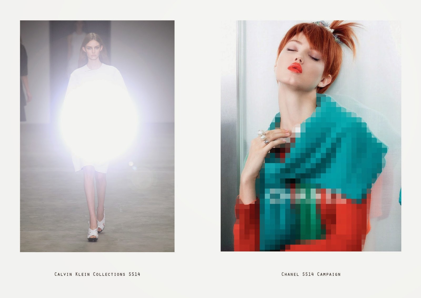
Me and Beth both felt that these two slides were the most important aspect of the trend that we had forecast. The image (above) is a mock up of our trend put into practice on both the catwalk and in an advertising campaign. One of the images appears to reflect the light dramatically, only allowing a partial glimpse of the garment, distorting the silhouette and only revealing minimal information.

The second image reveals slightly more information in terms of colour and shape, however fine detail is lost in the busy sea of pixels.

Cultural Radar presentation

Due to most members of the group being abscent, myself and Beth developed boards that we felt best represented our ideas clearly, paying attention to layout and the relationship between all images on each board.