New knitting samples- using cotton

After deciding that the colours I had previously used in my knitting samples were not suitable for the type of work that I wanted to produce, I began using some cotton yarns as opposed to lambswool.

The colours were much brighter and I've taken a sample of the colours that I have taken from photoshop here.

As you can see, the colours are much brighter and go with the rest of my work throughout the "Origins" unit.

I decided on these strong, bright colours at the right time as we were learning some new and exciting skills on the machine. I was learning to "partial knit" sections to give a sloping quality to the rows of knitting by only knitting a selection of the needles.


As you can see, the knit doesn't run in a straight line as it would traditionally.

Due to some experimentation, I also learned a new technique that wasn't actually shown to us and much to my surprise it worked! I used partial knit but instead of deselecting needles in a row next to each other, I left 3 needles and then deselected 3 so that it left some holes with the second colour coming through (below)

Additional knitting samples, new skills

I have picked up a lot of new skills during my time in knit. I have learnt how to make ladders and change the width of these ladders, giving the sample a delicacy, making it quite lacey.

I like the linear value the ladders give to the sample but it also means that it looks very soft and delicate and in some ways it is quite organic and I personally think it looks a little bit like spider's webs.

Again, my choice of yarn wasn't the best so I endeavour to redo this sample too. I do like this sample as a stand alone piece however it isn't appropriate with the rest of my work.

I've also learnt how to create lace-holes within my sample (as shown, left). I feel that this also gives a patterned quality to the knitting. It also adds a certain element of delicacy to the piece too. In this particular piece, I've used the two-colour stripe technique in conjunction with the lace-hole technique.

I'm learning to experiment with the domestic machine and the set of knitting skills that I'm learning in the coming weeks. Combining a limited set of skills means that the outcomes that can be made become unlimited and the uniqueness of your samples is down to your own creativity.

 I've also learned to "hook up", this technique gives a ruched effect.

I like the flexibility of this technique and you can be quite regimented and count which stiches you want to hook up, or you can do this in a more free way giving a less predictable effect to the sample.

Again in this particular piece, I have combined the two colour stripe and hooking up technique to create a ribbing effect.

Knitting samples

I began knitting on a domestic knitting machine just over a fortnight ago. I started by beginning with simple plain knit samples where I would change my colour to acheive a striped sample. I was selective with my colours, attempting to stick to neutral tones with flashes of a brighter colour.

Initially, I felt as though I was doing the right thing and had selected my yarns properly and appropriately to suit the style of my work. However, after a tutorial, it came to my attention that the decision to use wool was not appropriate to my method of working.

The wools had a marly appearance and the colour was not a strong flat colour that sat flat within the sample and that was the look I wanted to acheive.

I want to redo these samples in some of the brighter and more punchy colours in a cotton perhaps to allow the colour to sit flatly within the sample rather than it getting lost in a wash of grey.

I do think the proportion of colour within these particular samples is rather nice but I do want to re-knit so that all of my samples appear to be appropriate to all of my other practice.


ZoomInOnFashionTrends- issue 24

I spent quite a great deal of time looking at current trends and I wanted to test the longevity of my work, I decided to look at a previous issue of ZoomInOnFashionTrends from 2003 to identify any similar trends that have reoccurred recently and that keep coming back into the forefront of contemporary textile trends.
 
I was pleased to see that the "metamorphosis" trend, featuring bright colours and brave prints was quite similar to the "join the circus" and "playhouse" trends that are currently in circulation. It shows that the use of colourful and clashing work is nearly always on trend and shows a certain degree of longevity to my current practice.


Textile View Magazine- Issue 99

I wanted to look again at some more trends for the near future to establish my position within the current textile market. I decided to read the current issue of Textile View Magazine, as I know that they cover a large range of disciplines within textiles such as Haute Couture, menswear, womenswear, knitwear etc.

The overall layout of the trend board sections of the magazines allows me to identify immediately the colours, silhouettes and general feel of the trend and it means that at one glance I can immediately identify or disregard myself with a certain trend. For example, I could automatically see aspects of my own work with the "Join the Circus" trend, below.


This particular trend identifies bright colours, creative and exciting use of print and colour as well as a keen use of repeat pattern that I can associate myself with.


I also identified some similar attributes within the "Playhouse" trend, which focuses on colour, odd shapes and bright prints. All of which appeal to me and are reflected within my own practice.

New drawings

Like I said in my previous post, I've blown up sections of one of my previously created prints as can be seen in this image, below.

 
This image has been broken down into quite basic shapes that have been reflected. I would treat each shape as an individual shape when considering on how I would fill each gap.
 
I want to fill each one with a hand drawn/painted replica of the previously made prints. I feel that this would create a very intricate piece of work and it would be interesting to see how the colours and shapes would interact with each other when placed together in a single piece of work.
 
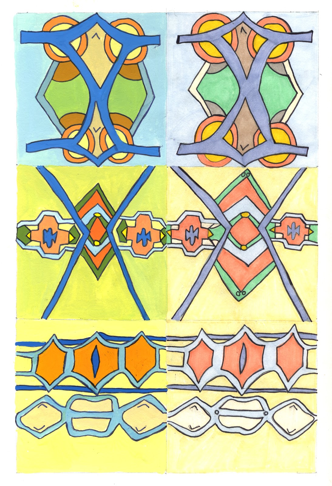
I drew out and simplified some sections of my older prints and redrew them into squares. I then decided to paint them using gouache paint, restricting myself to the colour pallette that I had already painted out and established. I've also coloured some of the squares using promarkers.

I feel that the promarkers(right hand collumn) give a bit of a wishy-washy appearance to the drawings and that is not what I set out to achieve.

However, the use of gouache provided me with a much sharper finish. I managed to get the consistency between the paint and water correct in order to achieve an even coverage of colour and meaning that I have allowed the colour to retain it's matte finish. I would go as far as to sat that certain sections of the painted pieces look as though they have been processed digitally. I then fine linered the edges of my drawings to finish  them and give them a crisp edge.

Overall, it was a time consuming process but I think the time and effort that has been put into them shows.

Choosing colours

After another tutorial, I came to a decision to move away from my cut paper work and develop my earlier prints further in a more innovative way. I began by extracting colours from my prints by painting out 4 key colours from each of the 4 prints (see below).


I've decided that I want to blow up certain areas of the prints that I have extracted. I then want to identify the key shapes within that blown up section and then hand paint the print within that print. It sounds extremely confusing but in practice it should work effectively.